The R.I. license-plate-design crisis continues
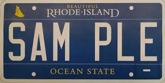
There is something about a bureaucrat that loves a poorly designed license plate. Only three weeks ago I was railing against new pink breast-cancer plate as an example of inexcusably deficient graphic quality. In that time, the State of Rhode Island and Providence Plantations, apparently tired with its "Wave" plate designed by the famous designer and RISD graduate Tyler Smith, has come up with an aggressively bland replacement.
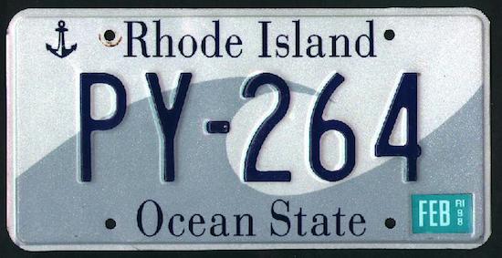
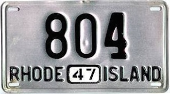
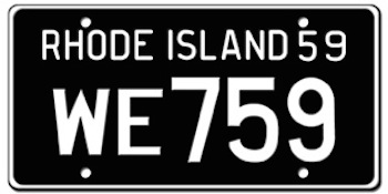
To begin with the letters are now all digitally printed, rather than embossed. Despite what 3M lobbyists may tell you, flat letters are not more visible. Rhode island has been about the last hold out with raised letters, which are not only more readable, but they are more elegant.
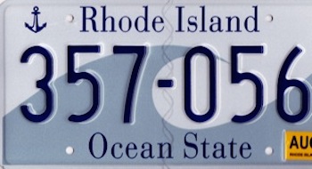
Which of the plates below is more legible?
The blue may be handsome, but its punch is mitigated by the white border, which tends to bleed out the blue. Using gold for the sailboat (which is too small to be really read properly) and the double mottos is just a little unnecessary glitz.
Why does a license plate even need a motto? Does the happy phrase "Ocean State" make us like ourselves more? Does it really boost tourism?
And as for "Beautiful," this new slogan that is being applied to roadsigns across Rhode Island is both superfluous (either our state is beautiful or it is not) and a mark of insecurity (do we really need to be told, are we not smart enough to figure it out, or is is like a creme that promises to make us feel more attractive?).
What is really sad is that past Rhode Island plates have been absolute winners in terms of dignity and superior design. Instead of adopting this undistinguished blue bit of blah, let us go back to the no-nonsense plates of the past. No mottos, so cheap boosterism, just our name.
William Morgan: A license plate worthy of Liberace
Photos (below) and comment by WILLIAM MORGAN The State of Rhode Island and Providence Plantations has blessedly not joined the rush to offer dozens of specialty and charity license plates. And not least of all, the base Rhode Island tag was designed by a noted graphic designer, Tyler Smith, and is quite handsome.
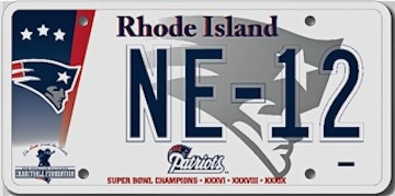
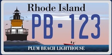
States such as Florida have scores, even hundreds, of affinity plates available for an extra fee. Rhode Island's paltry offering is only eight, including the Patriots and the Plum Island Lighthouse.
So far, Rhode Island has avoided any of the overtly religious, political and downright dumb plates that have made a mockery of the idea that a license plate is a nothing more than a way of identifying a vehicle–and not an opportunity to raise money for athletic leagues, Pro-Choice activists, or a big despoiling industry. Or as a Montana State Police captain said recently, "I need to see your number, not know what you favorite flavor of coffee is."
While one would not wish to discourage a few good charities from trying to raise money, I wonder if crowding a license plate with too much information and appalling design is really the most appropriate way to raise funds.
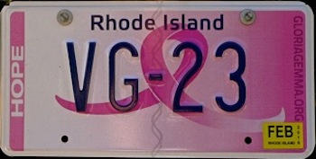
The Ocean State's latest affinity plate is for a noble aim – to fight breast cancer. $20 for each tag goes to the state's women's cancer-screening program. Marvelous. But is not then the next logical specialty plate one that would raise money for prostate-cancer research? What color would the ribbon be? The image of a little walnut-sized gland gracing the plate?
Hats off to the Gloria Gemma Breast Cancer Resources Foundation. But as an example of design from the "Creative Capital," this plate is a graphic disaster. The font for Rhode Island is too bland, for starters. Worst of all is the fading horizontal pink color scheme, as if the plate had been dipped halfway into a bucket of Pepto-Bismol. It looks like something Liberace ordered over the telephone.