So ugly that we'd miss it
From dartblog.com, run by Joseph Asch:
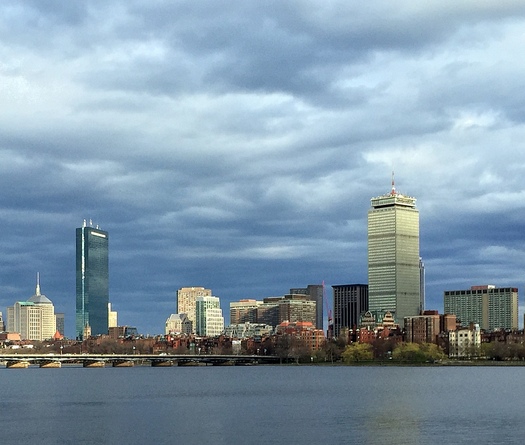
{Boston's} Prudential Center looks as good as it’s ever going to get in this iPhone 6 shot in angled evening light, but it doesn’t hold up to the John Hancock Tower, Henry N. Cobb’s 1976 creation (he was working at I.M. Pei’s firm). The two buildings offer a sharp contrast, don’t you think? Squat brutalist power facing sleek elegance. To my mind and eye, the Hancock building wins every time.
Addendum: Wikipedia summarizes the reception that the Pru received from architectural critics:
When it was built, the Prudential Tower received mostly positive architectural reviews. The New York Times called it “the showcase of the New Boston [representing] the agony and the ecstasy of a city striving to rise above the sordidness of its recent past”. But Ada Louise Huxtable called it “a flashy 52-story glass and aluminum tower … part of an over-scaled megalomaniac group shockingly unrelated to the city’s size, standards, or style. It is a slick developer’s model dropped into an urban renewal slot in Anycity, U.S.A.—a textbook example of urban character assassination.” Architect Donlyn Lyndon called it “an energetically ugly, square shaft that offends the Boston skyline more than any other structure”. In 1990, Boston Globe architecture critic Robert Campbell commented: “The Prudential Center has been the symbol of bad design in Boston for so long that we’d probably miss it if it disappeared.”
The individual critics have it right. 
