William Morgan: A medical firm’s lost design opportunity in a very dramatic spot
When can a substandard commercial building be transformed into good architecture? Can a despised icon of second-rate design become a beloved object? More specifically, can the ugly behemoth of University Orthopedics, in East Providence, R.I., overcome the stigma of being just another spec medical box?
University Orthopedics, 1 Kettle Point, East Providence, N/E/M/D Architects.
Photo by William Morgan
Kettle Point, which is also the site of a development of the kind of suburban housing seen near urban interstates everywhere, is a gorgeous promontory with unparalleled views of the Providence skyline, a working waterfront and down Narragansett Bay. If this site were not in the perceived ugly step-sister of East Providence, it would have been one of the most desirable pieces of land in the state. One thinks of what will happen to the neighboring Metacomet Golf Club course, glorious open land with tremendous potential: It will turn into the all-too-familiar faux-Colonial tackiness on a sea of asphalt.
Kettle Point housing development.
— Photo by Will Morgan
On the positive side, University Orthopedics is affiliated with Brown University’s Warren Alpert Medical School and so is one of the parts of Providence’s growing importance as a medical center. And the Kettle Point location offers expansive and maybe healing views of water, trees and skyline. This giant infusion of sunlight and a panorama of nature must surely contribute to the wellness of the patients and the happiness of the staff.
Providence harbor and downtown skyline from Kettle Point.
— Photo by William Morgan
The ugly duckling becomes a swan when a loved one needs treatment for osteoporosis or a broken limb. Then the state-of-the-art facilities and the staff’s training seem more important than aesthetics. But do they need to be mutually exclusive? What if the medical group that commissioned 1 Kettle Point had hired someone besides a value-engineering-minded developer? At the very least, a location this visible demanded a better design than a clunky real-estate container wrapped in cheap materials, one that looks like every other new medical office block from Boise to Little Rock.
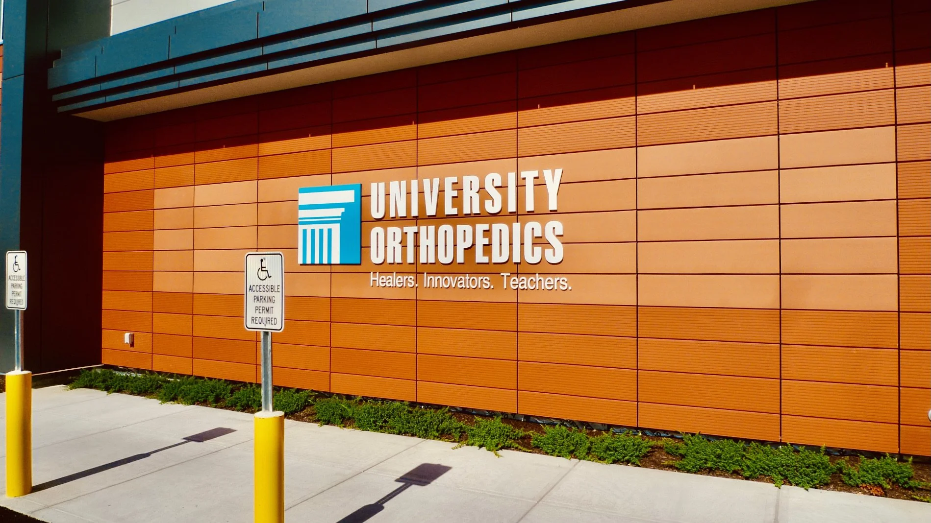
Does this signage or the Home Depot-orange cladding symbolize quality medicine and research?
— Photo by William Morgan
A sensitive architect might have at least given 1 Kettle Point a more distinctive skyline. (Please do not whine that a good architect costs too much, as a really smart designer might have even given University Orthopedics a lot more for less.) And given such an environmentally sensitive site, a landscape architect should have been consulted, and maybe allowed to integrate this hulk into its prime surroundings.
Alas, the response in our high-quality (for those who can access it) but often unobtainable, fragmented and even chaotic American health-care system to such concerns is always one of money. What a building looks like seems minor compared to the medicine it delivers. But why not heal the entire patient, while at the same time supporting a quality building that could have been a great advertisement for the practice, for Brown, for Rhode Island?
The handsome lights on the stair compliment the undoubtedly unintentional industrial aesthetic of the metal railings.
— Photo by Will Morgan
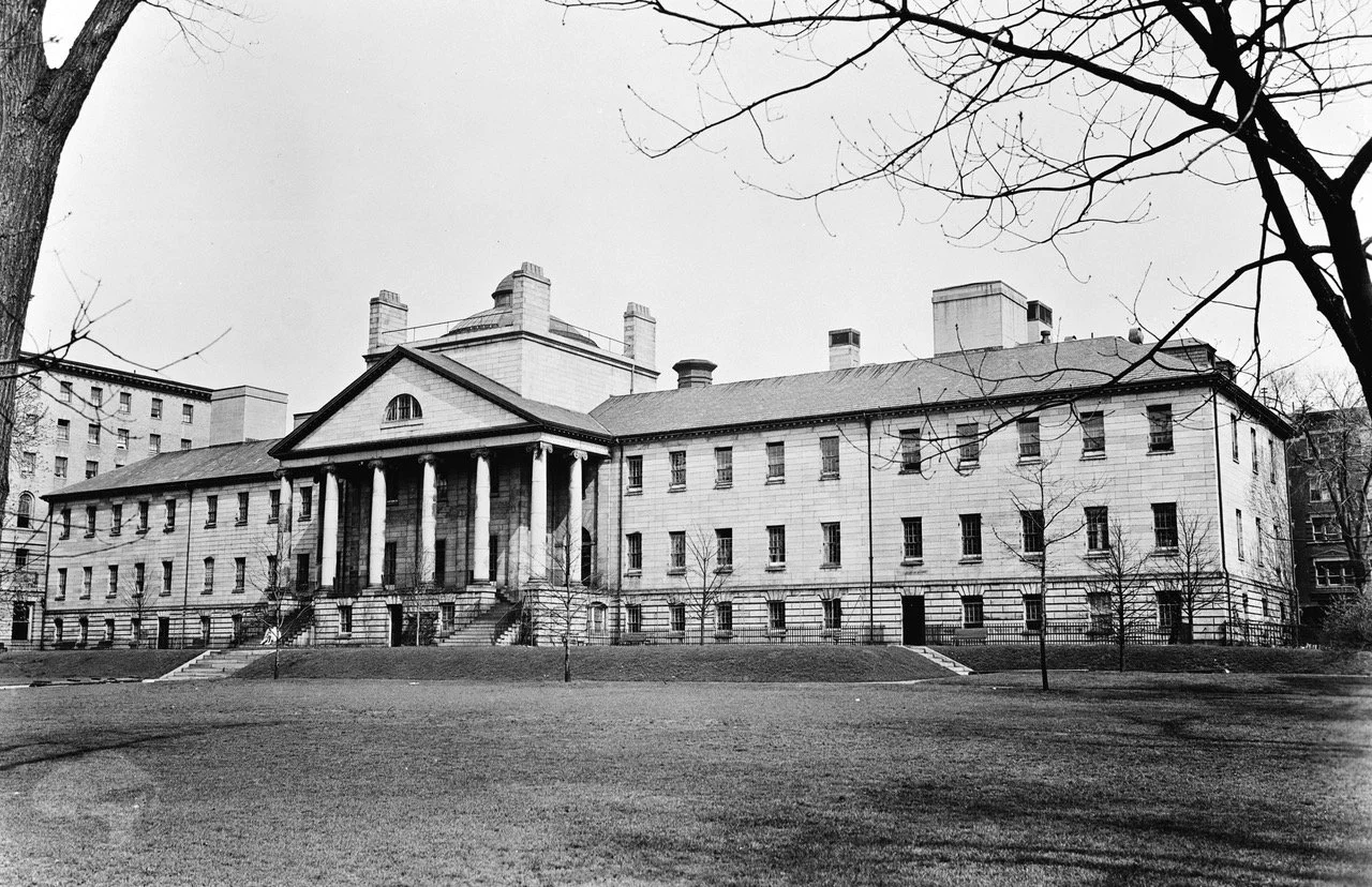
Hospital needs, admittedly, dictate their forms. Think of all the university-affiliated and other medical centers that keep spreading across America, with new wings and additions, often in disparate styles. Yet, a handsome example that exists within the jumble of buildings that comprise the main campus of the august Massachusetts General Hospital, in Boston, is the handsome neoclassical original building, designed by Charles Bulfinch. In erecting their signature structure, the hospital trustees chose the architect of both the Massachusetts State House and the U.S. Capitol.
Massachusetts General Hospital, Charles Bulfinch, architect, 1818-23. Wikimedia Commons.
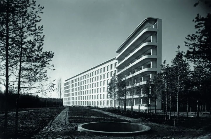
My favorite example of a successful hospital that is also a work of architecture is a tuberculosis sanatorium in rural Finland, designed in 1929 by a then-young Alvar Aalto. Built with limited resources, the sanatorium launched Aalto’s career, but it also became one of the noblest landmarks of modern architecture. The revolutionary aspects of the design were dictated by the treatment of TB, which emphasized abundant sunlight and fresh air. Aalto fashioned draft-less windows and splash-less sinks, along with bright colors and inexpensive furniture that is still being manufactured.
Tuberculosis sanatorium, Paimio, Finland, 1929-33.
— Photo by the Alvar Aalto Foundation.
Why should what University Orthopedics looks like, and how it contributes to or detracts from its environment, be any less important than the layout of its labs and operating rooms? This medical group, presumably, would not accept low professional standards of medicine. So, it is unfortunate that, in the quest for medical integrity, University Orthopedics’ patronage did not aspire to high standards of architectural design
William Morgan has taught the history of modern architecture at several colleges, including Princeton and Roger Williams Universities, and has written extensively on Finnish architecture.


