William Morgan: All that and nothing at all; how not to promote a state
The State of Rhode Island, beset by the self-inflicted woes of failing infrastructure, persistent corruption and a lack of self-confidence, has launched a new tourism initiative that it hopes will bring swarms of visitors to our shores this summer. “All That” is the campaign’s motto.
All That, period. What’s more banal than a lighthouse?
—Commerce Rhode Island
Despite its 1990s hip-hop vibe, the pandering of Rhode Island to potential visitors is clothed in familiar banal corporate-speak, accompanied by photographs of lighthouses and Newport mansions, with “All That” splashed across them.
There are videos showing young and happy revelers biking, surfing, dining – creepily identical to the branding firm’s clips on Belize, Park City, and other fun destinations–what you might expect from a Florida agency whose motto is “We make momentum happen’’.
Why does our culturally and geographically endowed Rhode Island need this everywhere -- and — everyone sanitized vision of itself?
Rhode Island is not the only state going through the periodic contortions of trying to sell themselves to mythical, profligate-spending hordes of tourists. Politicians are also easy marks for snake-oil salesmen of new images that they hope will appeal to the electorate.
(“All That”has apparently cost taxpayers half a million dollars, but queries through the Access to Public Records Act will no doubt reveal a much higher figure.)
Political appointments offer clues about the cluelessness of heads of state, so it should come as no surprise that Anika Kirble-Huntley, the chief marketing officer for Rhode Island Commerce, has spent her entire career in the casino industry.
Fun-Sized, perhaps, but what potential tourist would be enchanted by this murky and grim image?
—VisitRhodeIsland.com
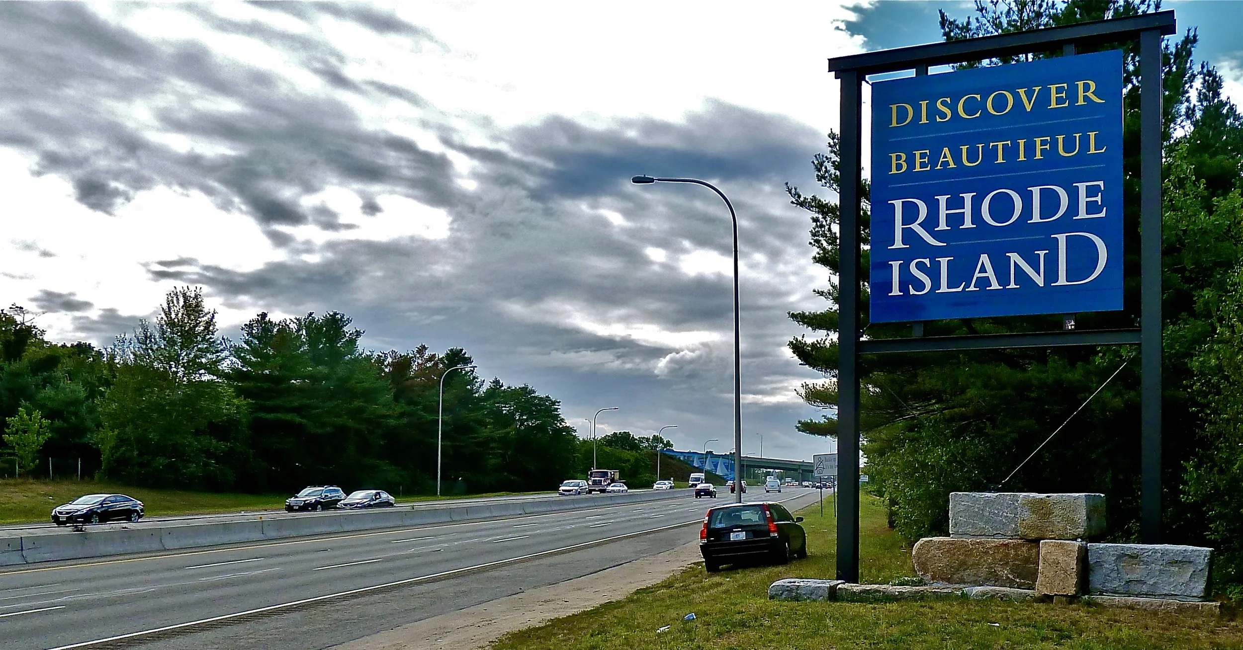
“All That” is the fourth tourism re-brand fiasco in recent years. There was the embarrassing “Fun-Sized” campaign, and the slightly mysterious “Whatever you do …” The most infamous, however, was when Rhode Island hired design-great Milton Glaser to come up with the tepid slogan “Cooler and Warmer,” complete with a clip of alleged local skateboarders zipping along the harborside – in Reykjavik. Slightly less egregious was “Discover Beautiful Rhode Island,” whose chief legacy is handsome signs positioned at the state line.
A quiet sign exhorting Rhode Islanders to discover where we live; tourists on I-195 are in a rush to get to Cape Cod.
— Photo by William Morgan
Rhode Island, to which my wife and I moved to by choice twenty-five years ago, may be the smallest state by area, yet it boasts 400 miles of Atlantic shore, a rich 400-year history seen in an incredible array of outstanding architecture. We were enchanted by Rhode Island’s diversity, its food, its educational institutions, and its palpable tradition of independence and tolerance.
Content with Rhode Island, I do not envy any state its bigger size. But, at the other side of the continent, I am in awe of Alaska’s waving identifier. It is an impeccable and unimpeachable symbol, perhaps the best advertisement for any American government entity. There are no mottos, no Latin phrases, no animals, or any potentially controversial figures – just a tribute to the northern sky.
The blue field with the gold stars of the Big Dipper pointing to the North Star, is a simple, strong, and recognizable design that has served boldly for a century, from territory to 49th state. This powerful, no-nonsense banner, adopted in 1927, will look fresh in another hundred years. Part of the brilliance of the design lies in its genesis: the American Legion sponsored a competition among school students throughout the territory that brought forth 700 entries. The winner was Benny Benson, a Native Alaskan orphan. For his brilliant scheme Benson was given a gold watch and $1,000. As “All That” demonstrates, the price of re-branding has gone way up, and handsome civic design is mostly a thing of the past.
The flag of Alaska, designed almost a century ago.
Rhode Island would have been better served by giving the money spent on the advertisements to folks to enable them to host visitors. The people who run the state gravitate to bigger scams, such as pro-sports stadiums, movie studios, and dubious highway contracts. Citizens will never see much of this squandered money again, even though we will be underwriting it for decades. Nevertheless, it is time to stop wasting dollars on silly, meaningless, and dubiously ineffective tourism promotions. Like the Alaska flag, Rhode Island itself ought to be advertisement enough.
William Morgan is an architectural writer based in Providence. His latest book is Academia: Collegiate Gothic Architecture in the United States (Abbeville).


